Megabus Value Proposition
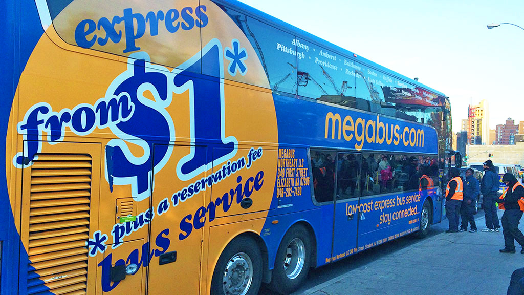
Megabus, branded as megabus.com, is the first, low-cost, express bus service to offer city-to-city travel for as low as $1 via the Internet.
Personal design challenge
Create an improved digital experience for frequent megabusers.
Megabus caters to a young, technology obsessed demographic, yet their app is virtually useless. As a frequent megabuser, I decided to turn these mind numbing bus rides into an opportunity to conduct research and chat with my fellow megabusers about an improved digital experience.
iOS
Megabus, branded as megabus.com, is the first, low-cost, express bus service to offer city-to-city travel for as low as $1 via the Internet.

Megabusers are primarily students and young professionals in urban areas.
With its free wifi and at-seat power outlets, Megabus is the choice bus line for technology-obsessed millenials.

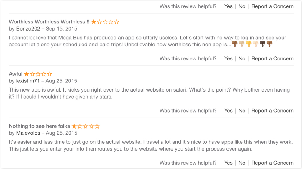
The existing iOS Megabus app has a dismal 1.5 star average rating. Out of 293 ratings and reviews, megabusers unanimously mark the app as useless, but are asking for one that works. Megabusers could benefit from an optimized mobile experience.
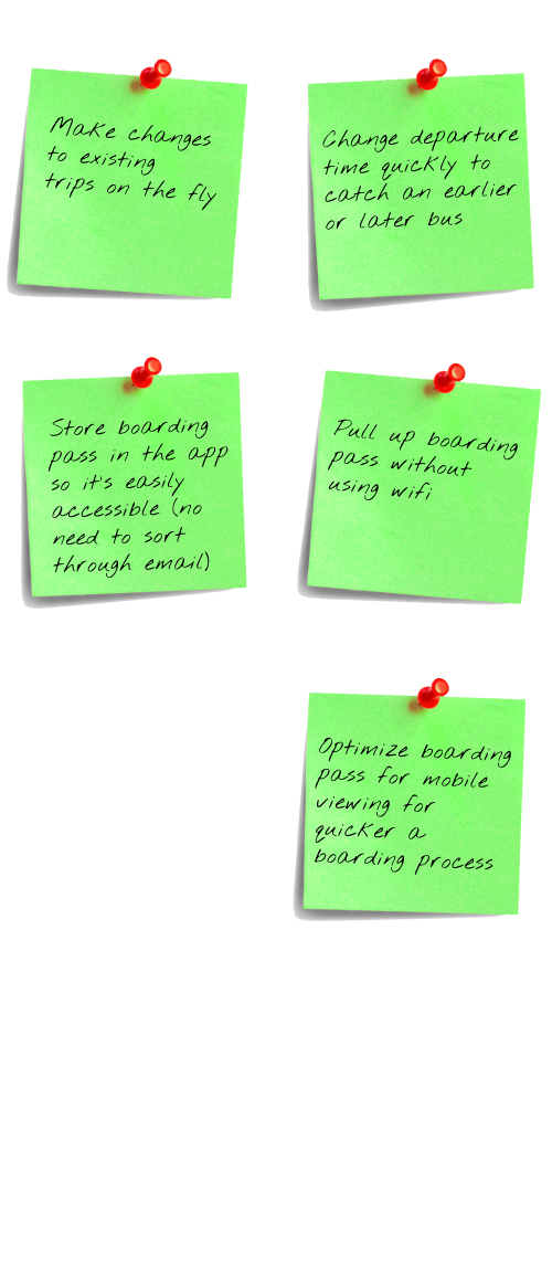
Almost all of these megabusers use their smart phones to display their boarding pass, which is not optimized for mobile viewing and must be retrieved through email. They are also frequently checking the status of their trip, and occasionally updating departure times. All of these actions are completed via their mobile devices, yet none of these actions are optimized for mobile devices.
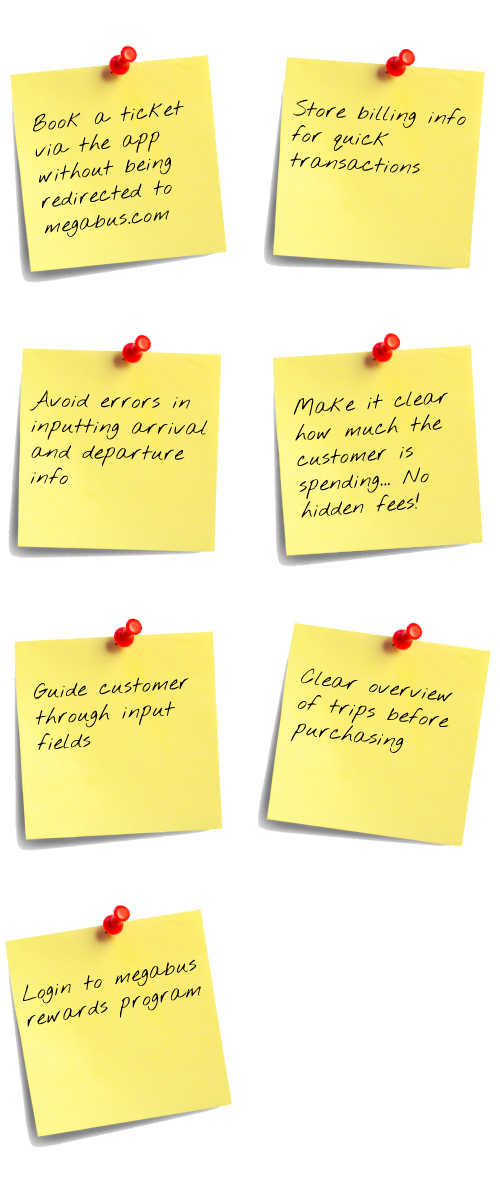
Apps are focused on loyal customers, which is my target audience. An app would store a megabuser's billing information, frequently traveled places, boarding passes, etc resulting in a quicker and easier checkout and boarding process. An app is also more integrated with other mobile applications, such as alerts and messaging, which would enable Megabus to send schedule updates and travel notifications. There is also potential to collect data from megabusers through in-app surveys, etc.
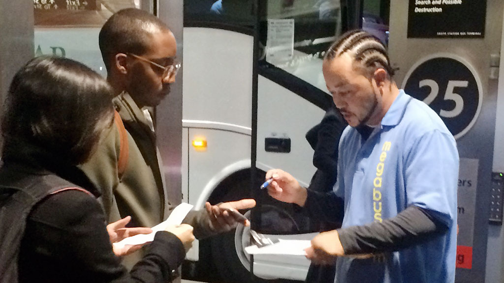
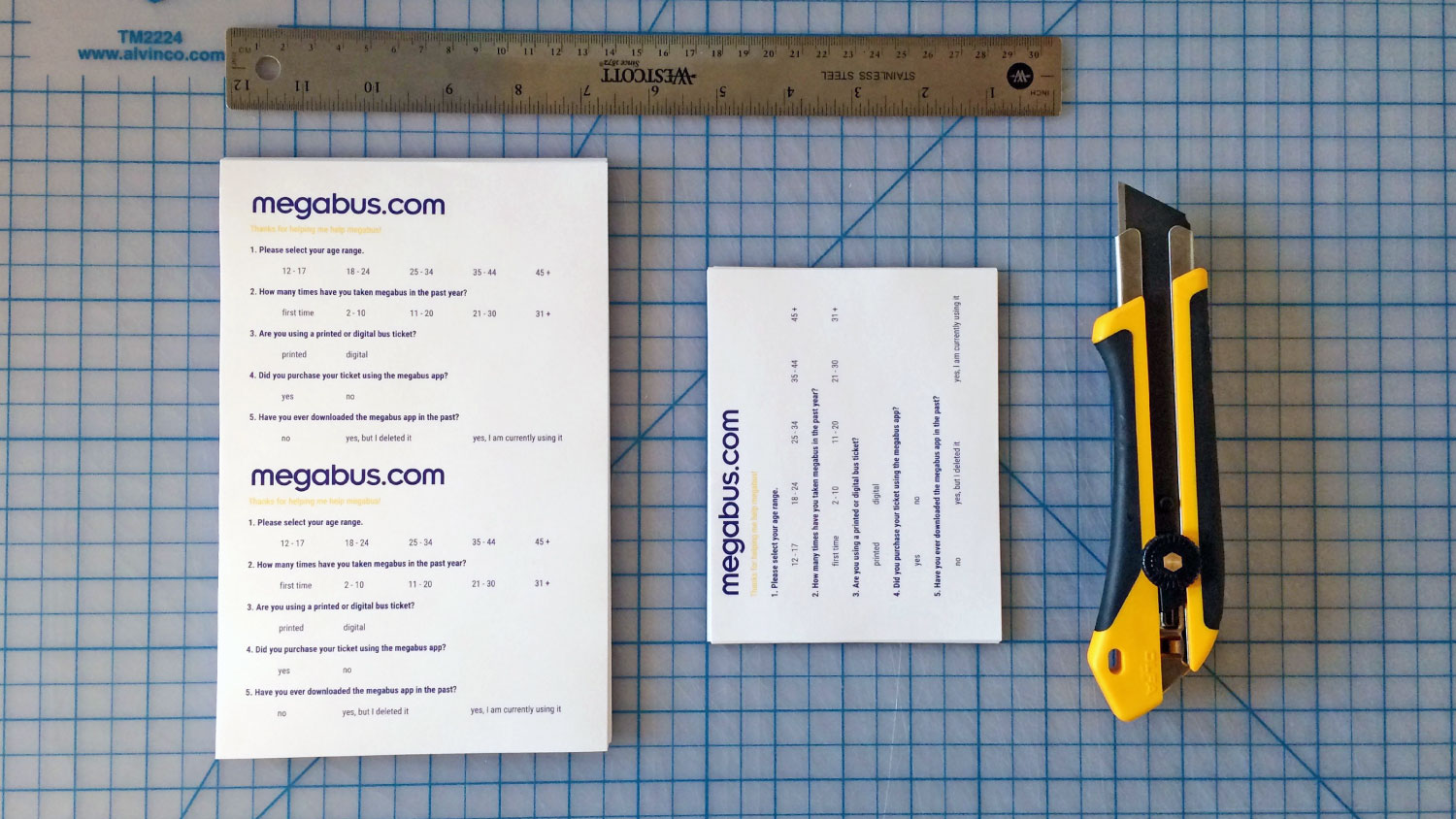
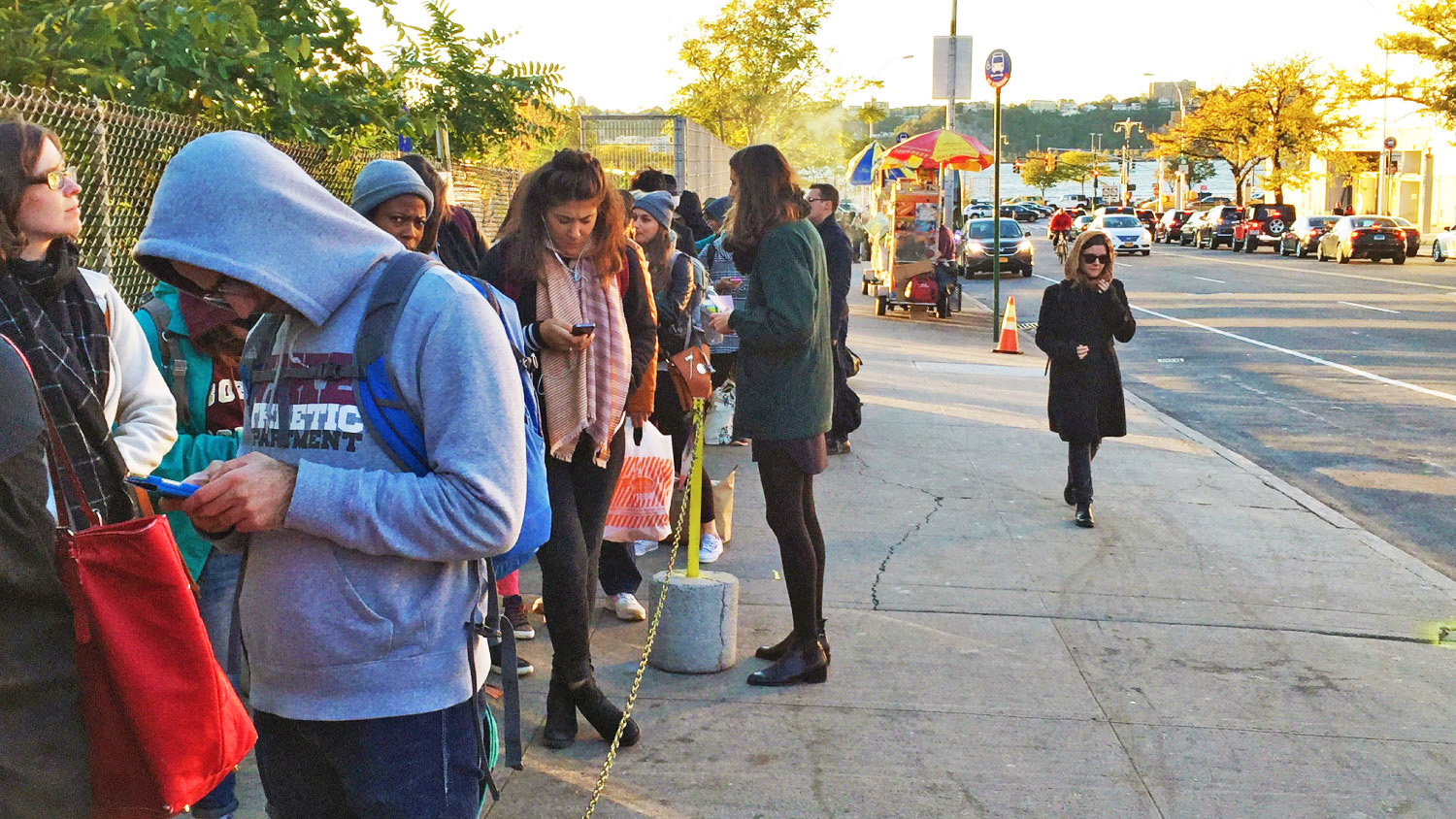
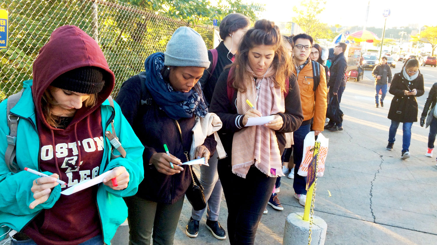
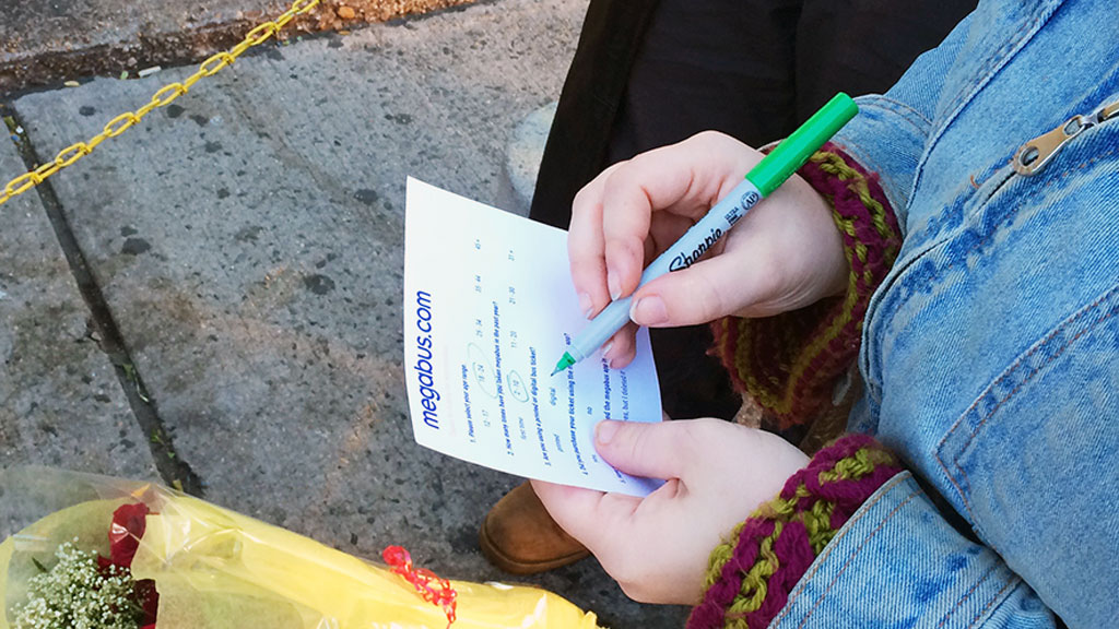
I wanted to gauge interest in an app and learn more about these megabusers, so I created a survey. I handed it out to 50 people in the megabus queue in NYC and 50 people in the queue in Boston.
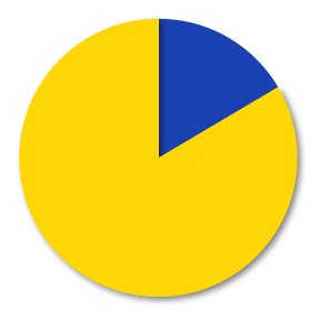
85% of surveyed megabusers are between the ages of 18 and 24.
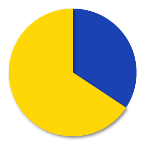
66% of surveyed megabusers are frequent bus riders with the majority taking Megabus 11 - 20 times a year.
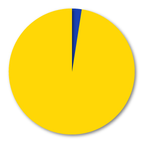
92% of surveyed megabusers use digital bus tickets.
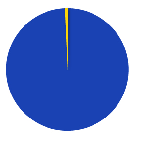
1% of surveyed megabusers used the Megabus app to purchase their bus ticket.
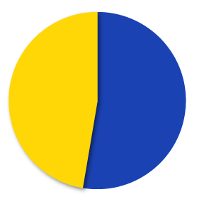
45% of surveyed megabusers have downloaded the Megabus app, but deleted it.
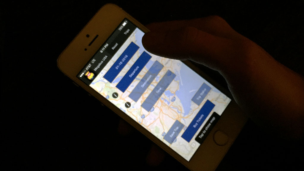
No login
Poor layout and hierarchy
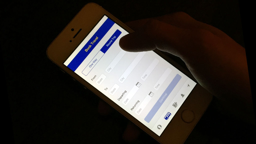
No option to book roundtrip
Allows user to time travel...
Cluttered with overlays and transparencies
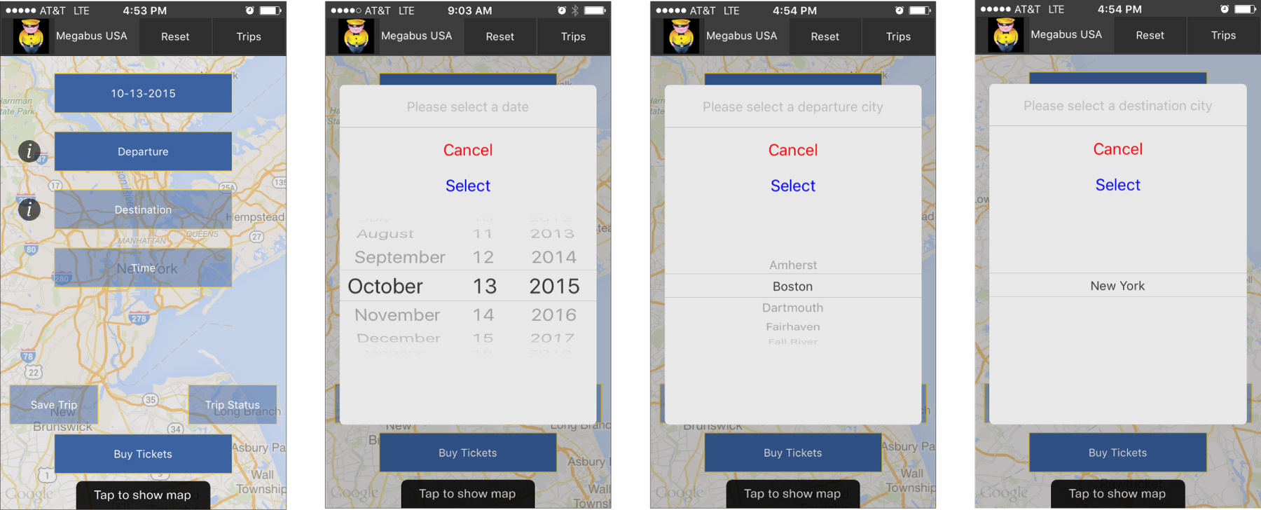
Does not guide user in next selection
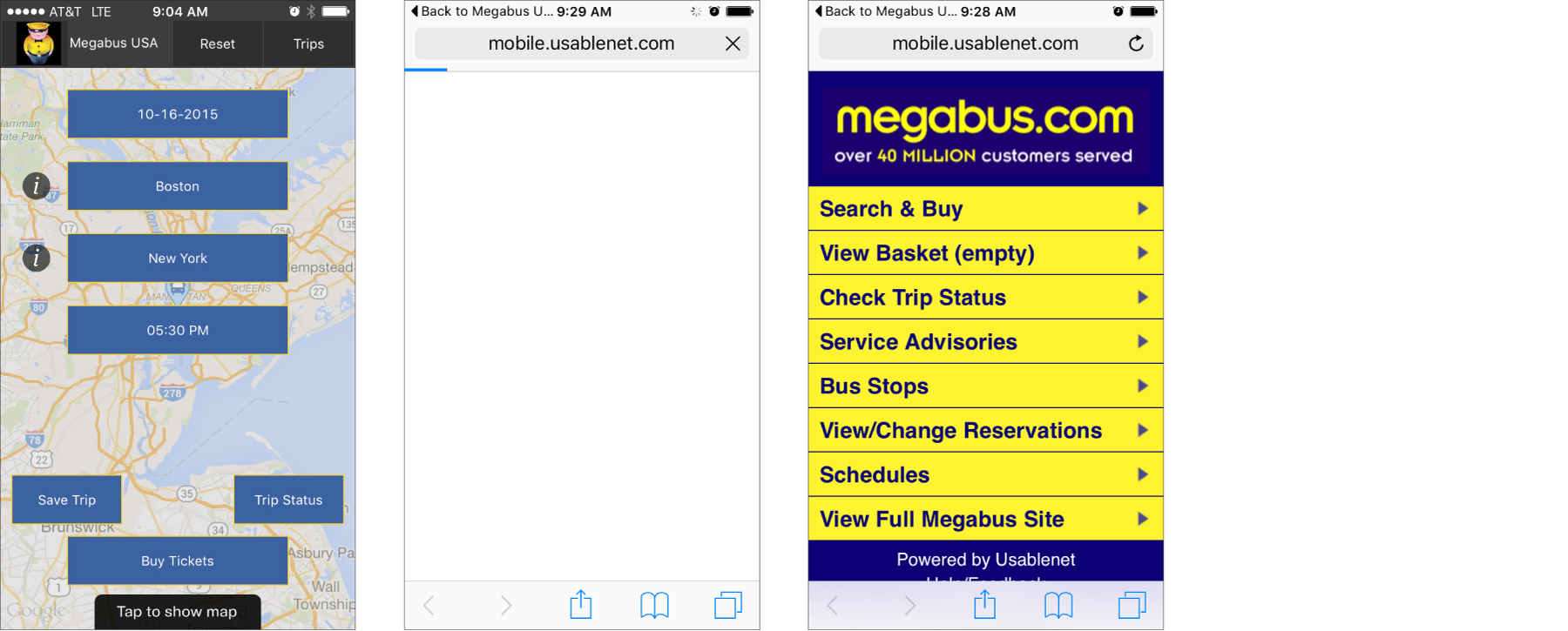
After entering all info, the app simply redirects user to Megabus mobile webpage
User cannot purchase a ticket directly in the app
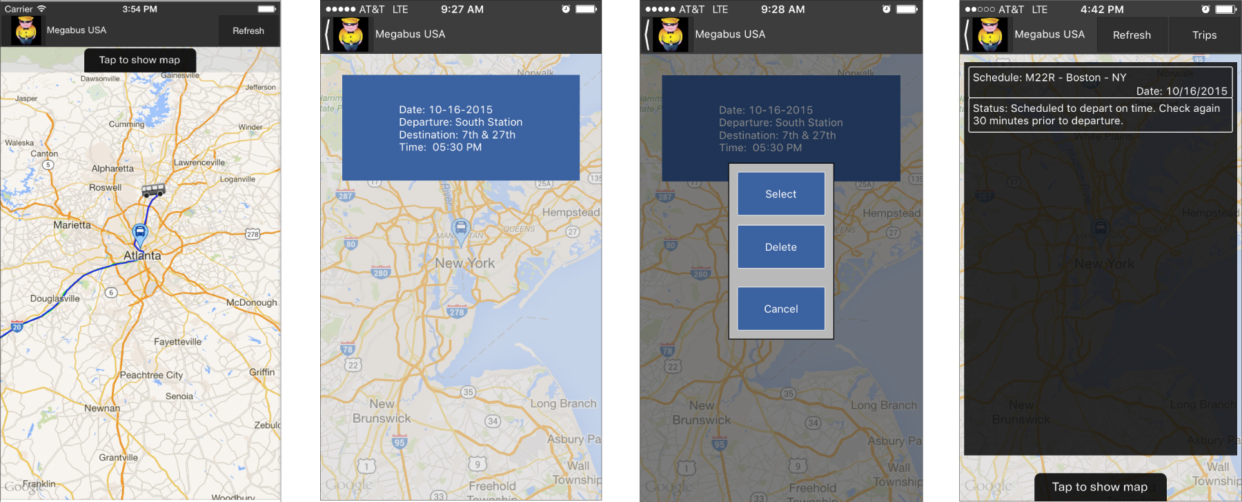
"Tap to show map" only provides a visual current location
"Save Trip" is not reflective of user's actual reservation. "Delete" only deletes what is saved in the app.
"Trip Status" does not reflect actual reservation

Sarah was one of the 100 surveyed megabusers who has tried the app but no longer uses it.
Sarah's survey results:
> 18-24 years old
> Takes megabus 21-30 times a year
> Always uses a digital boarding pass
> Did not purchase her ticket via the megabus app.
> Has downloaded the megabus app in the past, but deleted it.

Marta was one of the 100 surveyed megabusers who was not familiar with the megabus app, but was interested in using it.
Marta's survey results:
> 18-24 years old
> Takes megabus 11-20 times a year
> Always uses a digital boarding pass
> Did not purchase her ticket via the megabus app.
> Has never used the megabus app.


Megabus brands itself using blue and yellow, yet the blue and yellow used on their website is different from the blue and yellow used on their fleet of buses, which is different from the blue and yellow used on their employee uniforms, and so on...
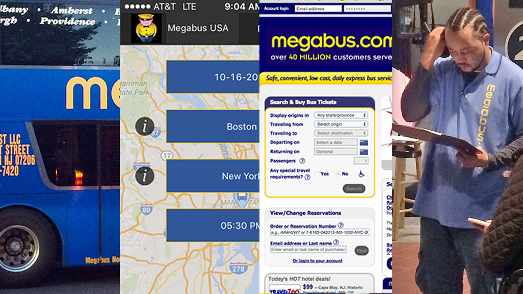
Changing the colors on their fleet would also be the largest investment to change. Because of this, I matched the blue and yellow used on their buses to establish consistent branding across all platforms.


Clean layout
Clear and consistent branding
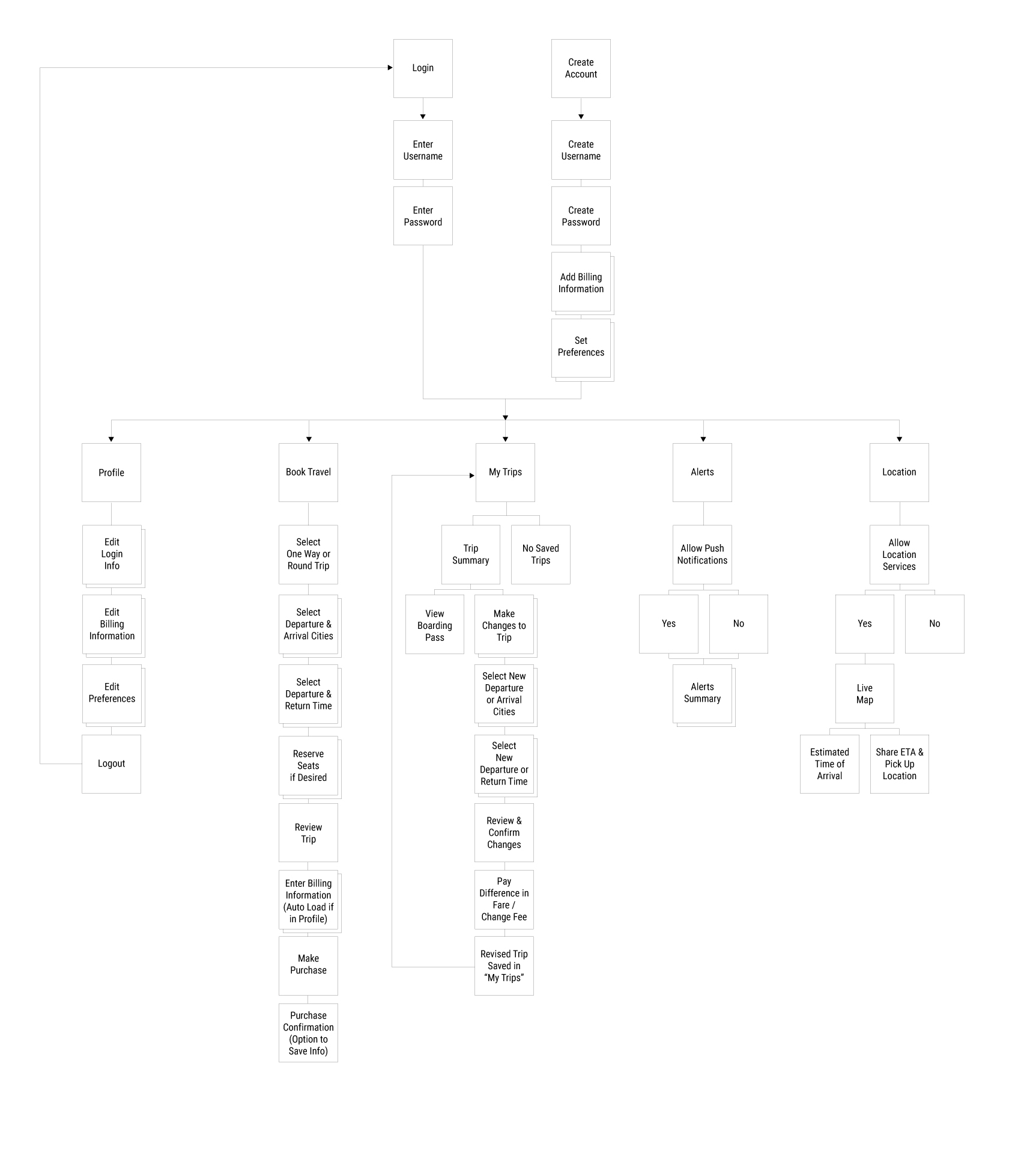
Login and create account options in order to take advantage of the app's features (no guest checkout)
Moved cta's to bottom of screen for ease of reach
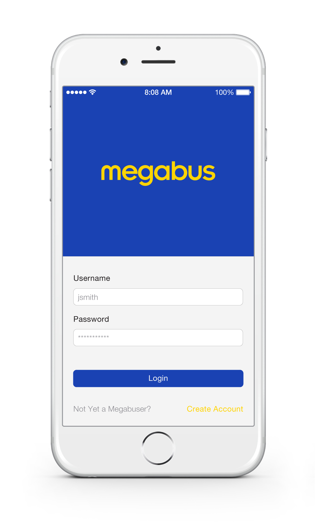
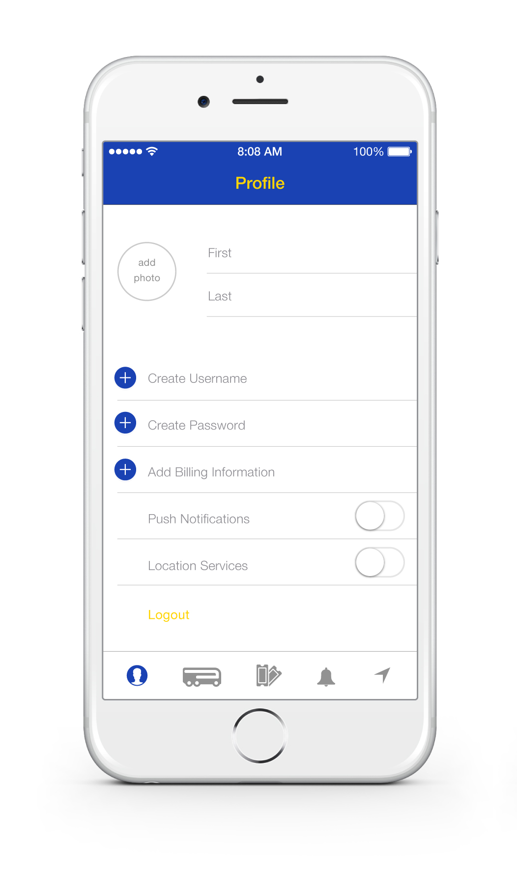
Familiar iOS visual language
Clear menu bar for easily navigation
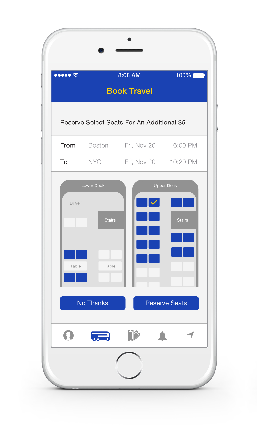
Color used to guide user selection
Add billing information for faster checkouts
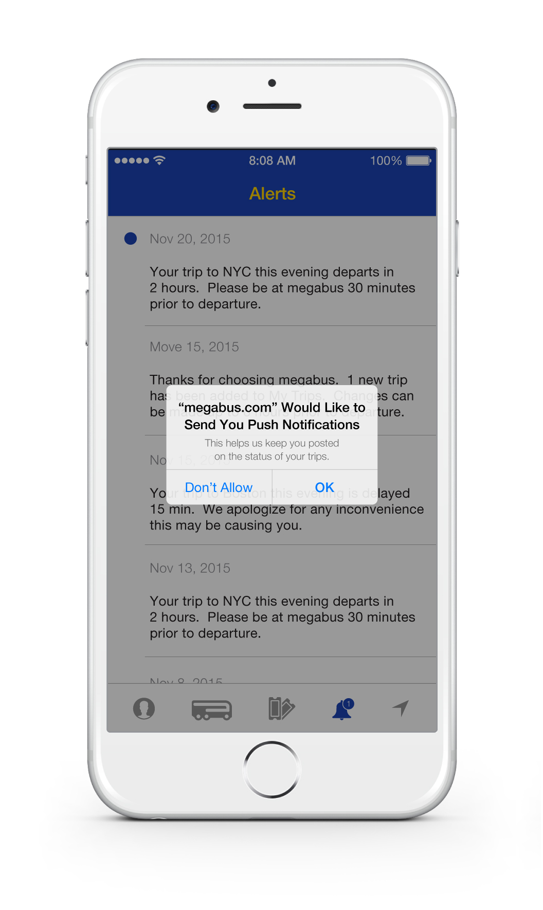
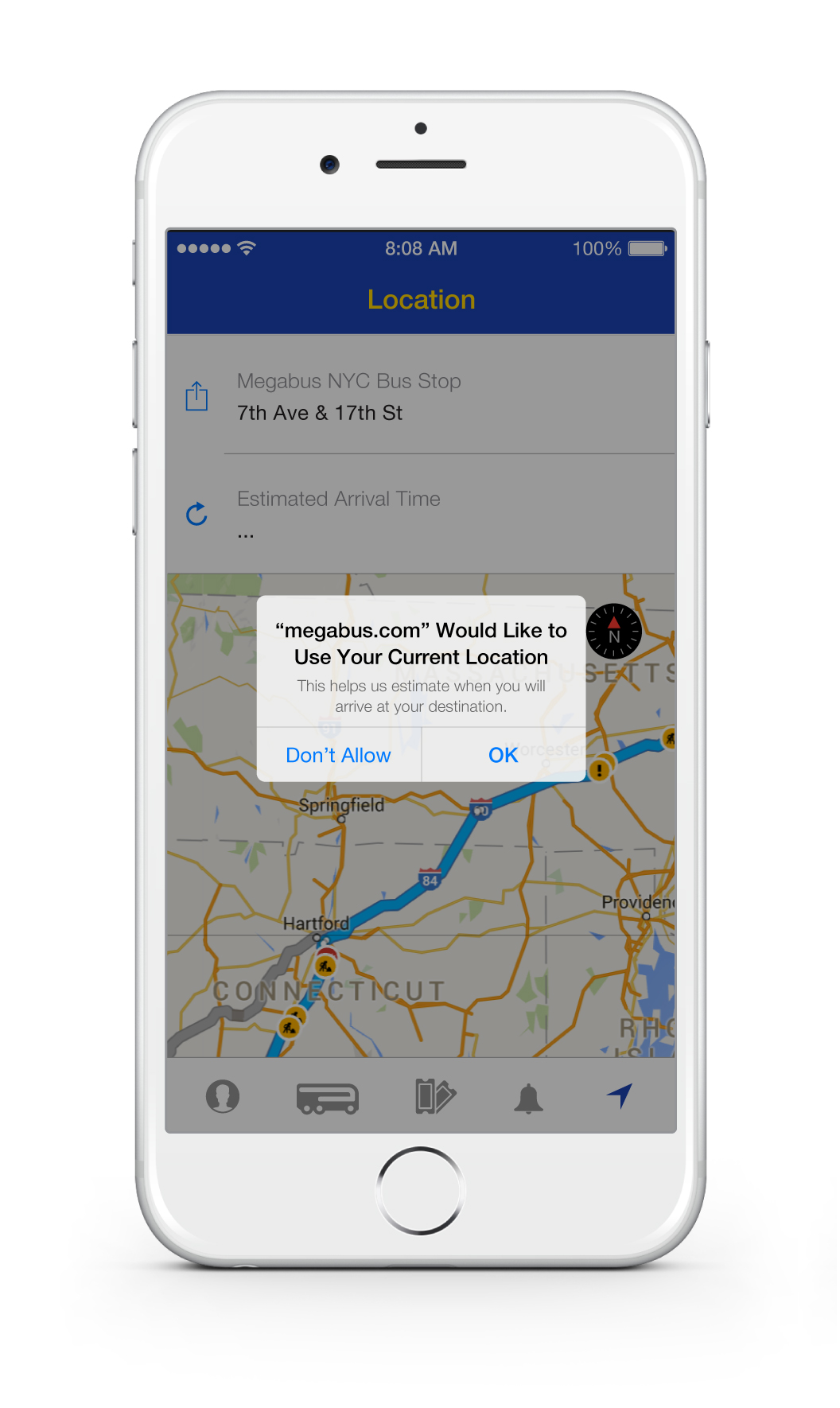
Push Notifications and Location Services for an integrated app experience
Easily switch from One Way to Round Trip booking
Clear layout with appropriately sized input fields to guide user
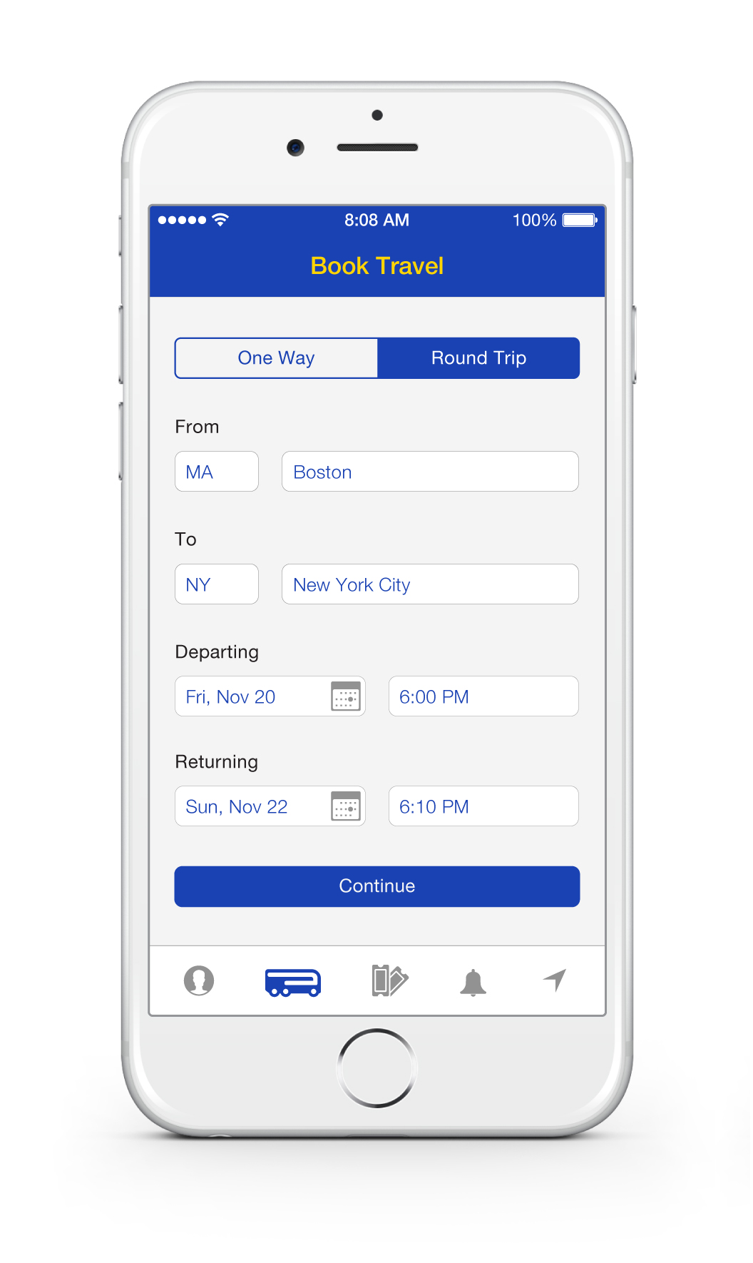
"Continue" button remains transparent until all input fields are appropriately completed
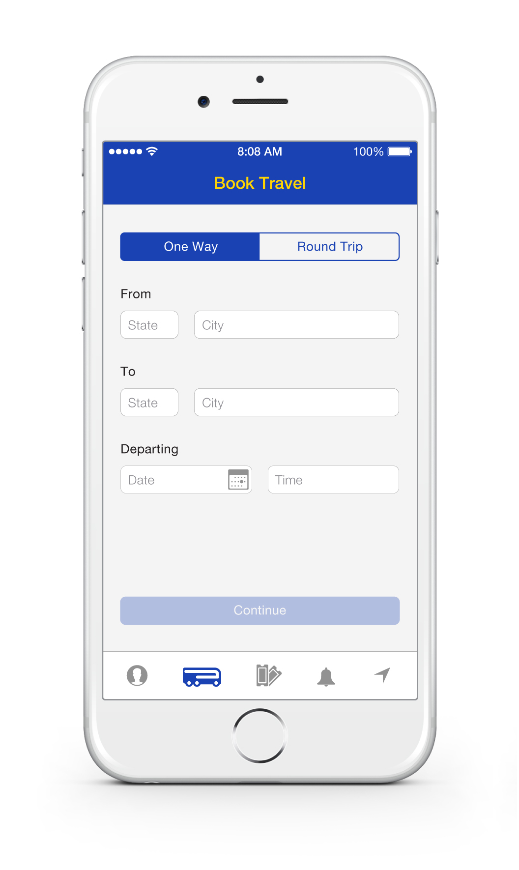
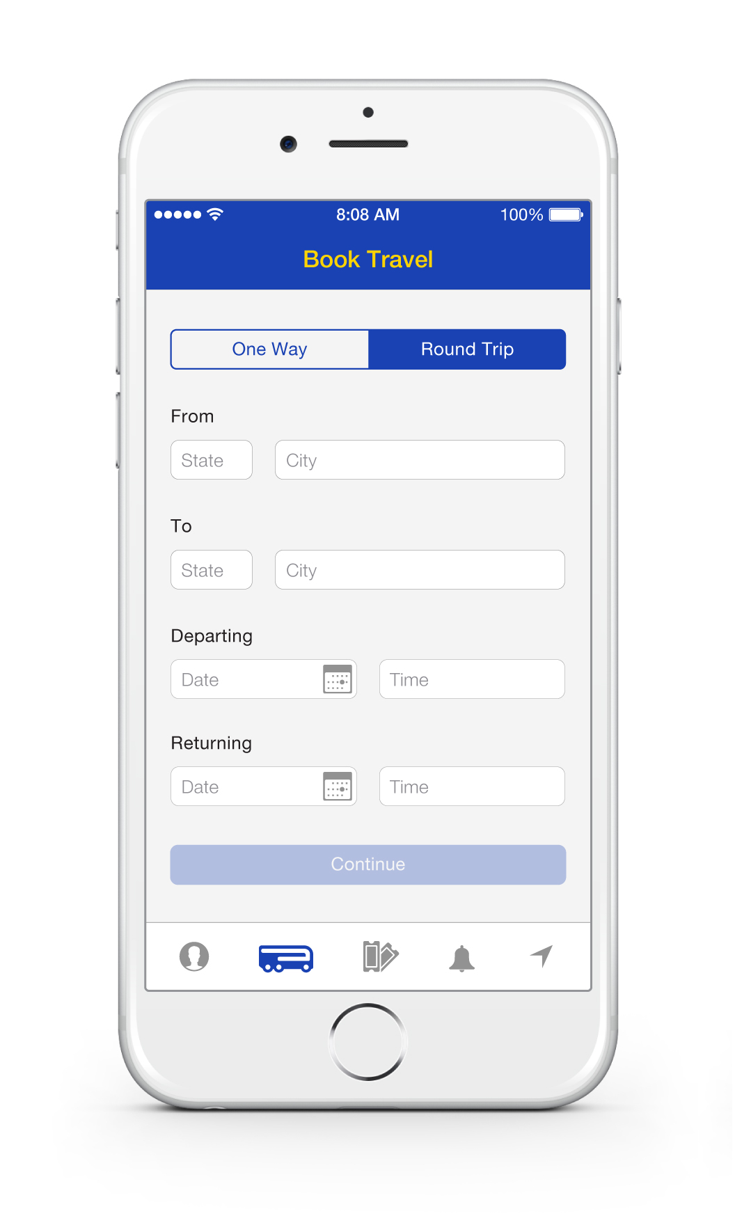
Calendar icon for easy date selection
"Continue" button becomes opaque to indicate completion of all input fields
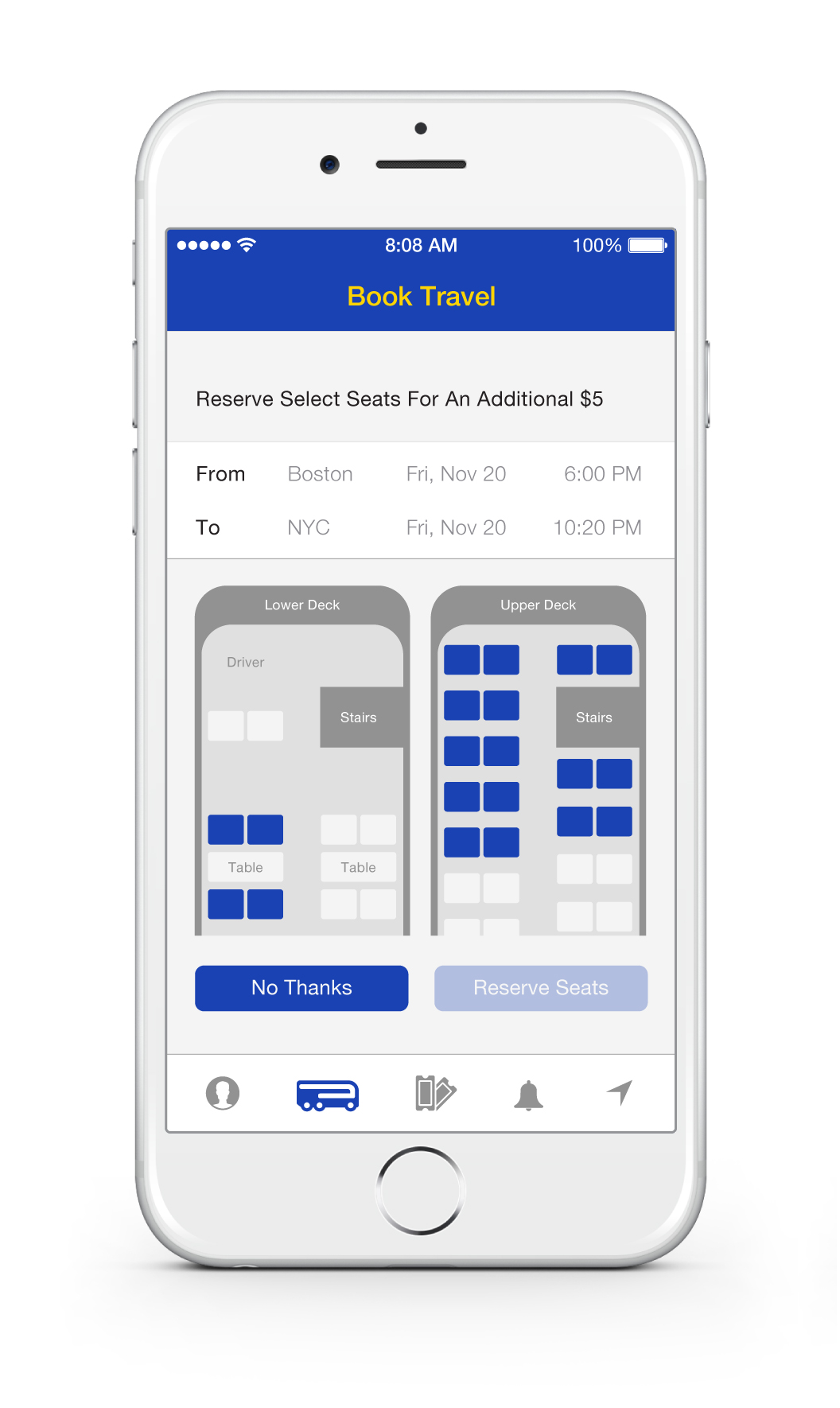
Clear seat selection graphic
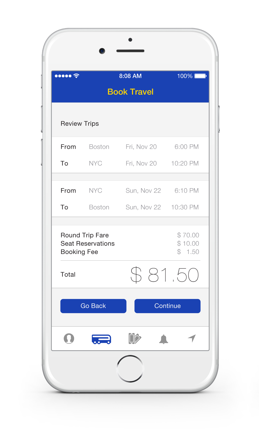
Clear overview of selected trips
Breakdown of total fare with no hidden fees
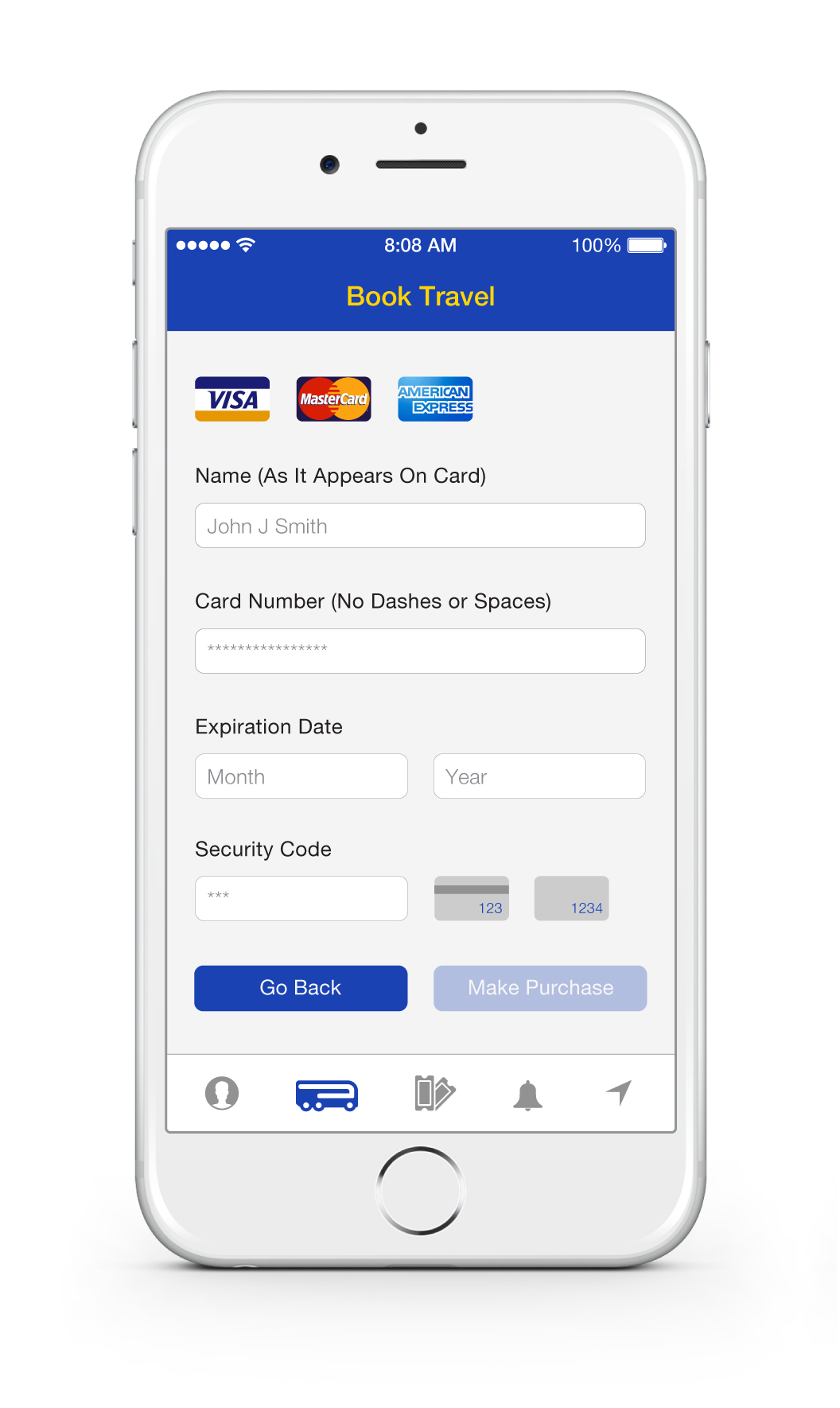
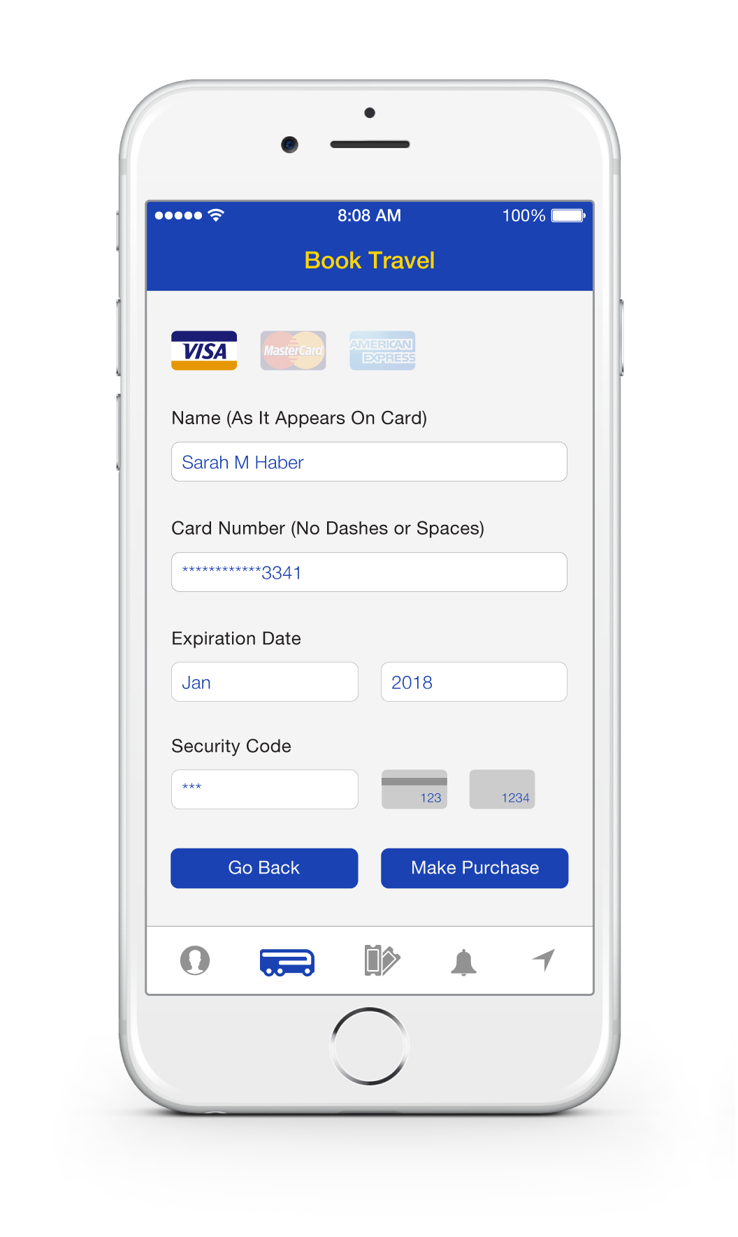
Clear graphic of credit cards accepted and security code location
"Go Back" option is comforting, giving the user an option to make changes
"Make Purchase" indicates a transaction, instead of "Continue" which only indicates a next step
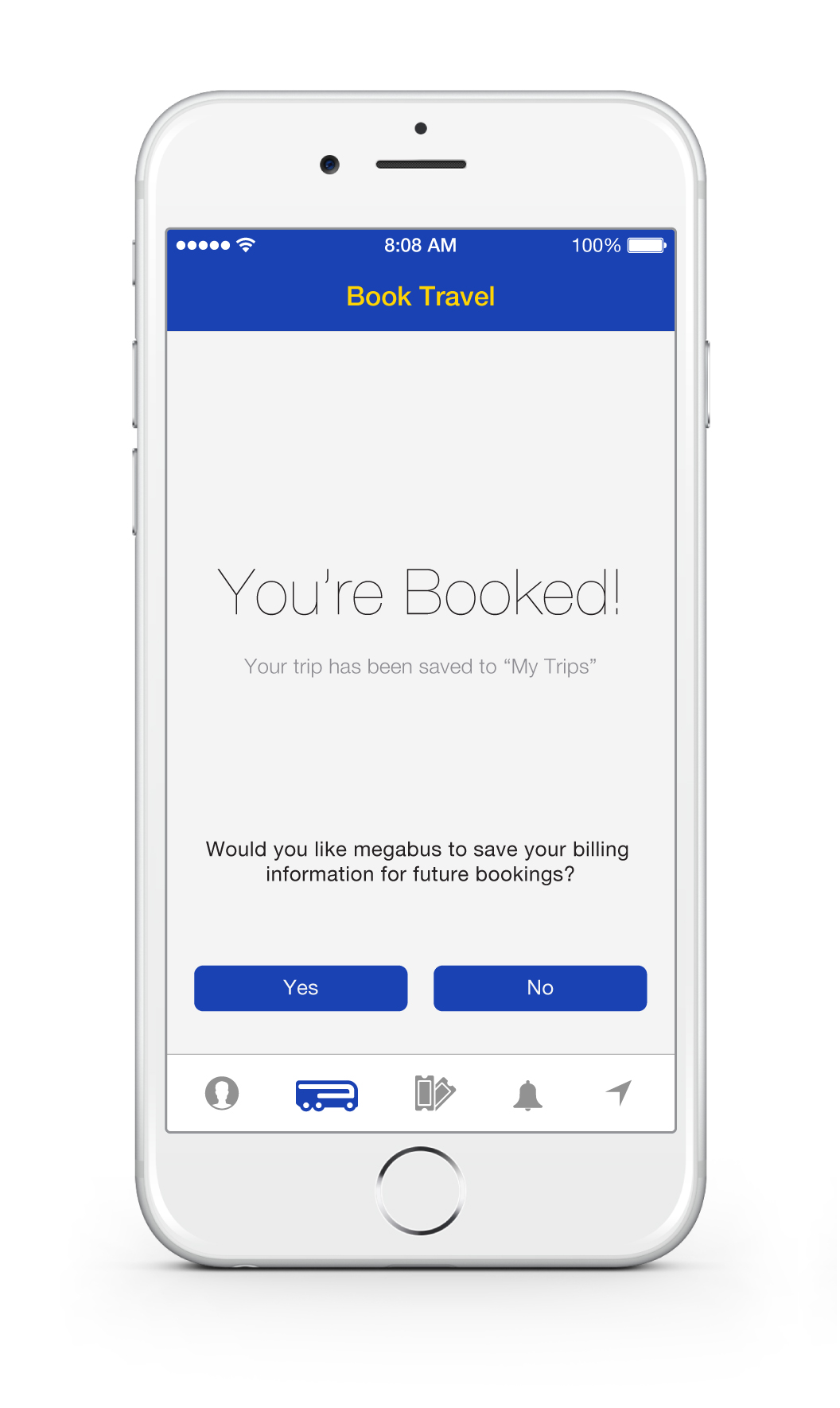
Confirmation that the transaction was completed
Option to save Billing Information in Profile if not yet entered by user
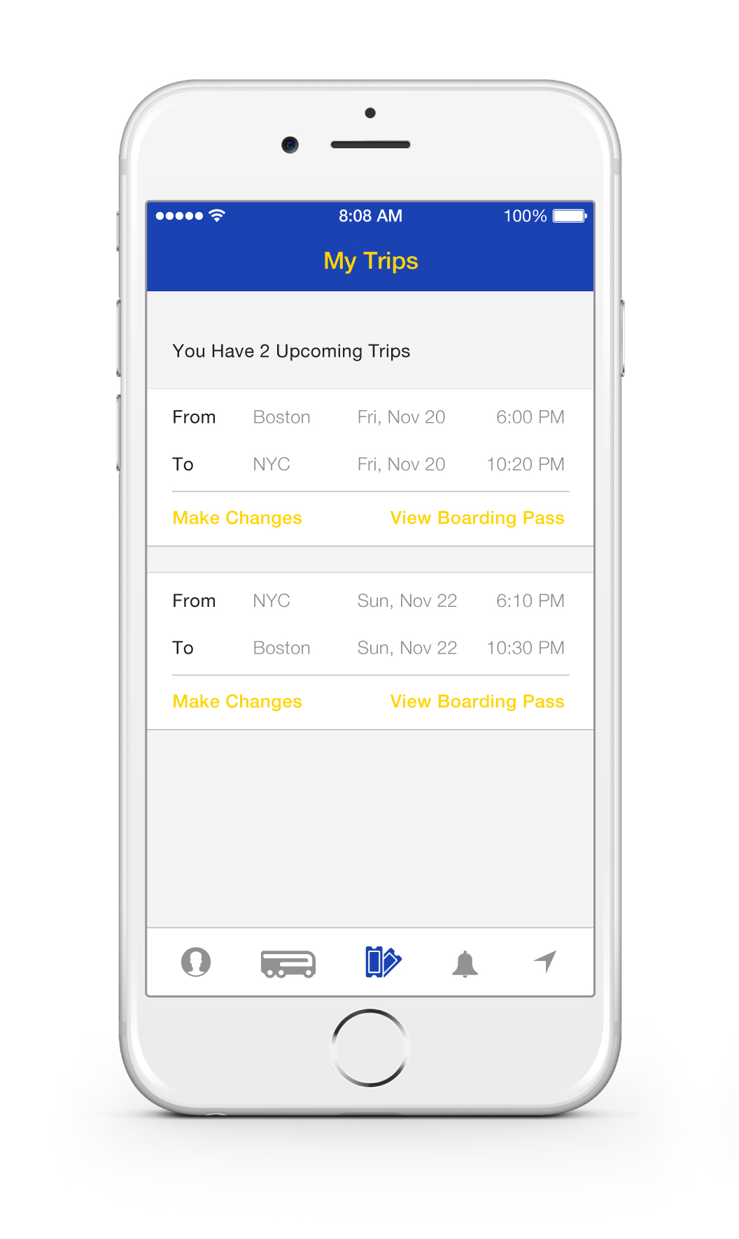
Clear overview of all current trips
"Make Changes" option to quickly alter existing reservations
"View Boarding Pass" to quickly pull up boarding pass at bus terminal
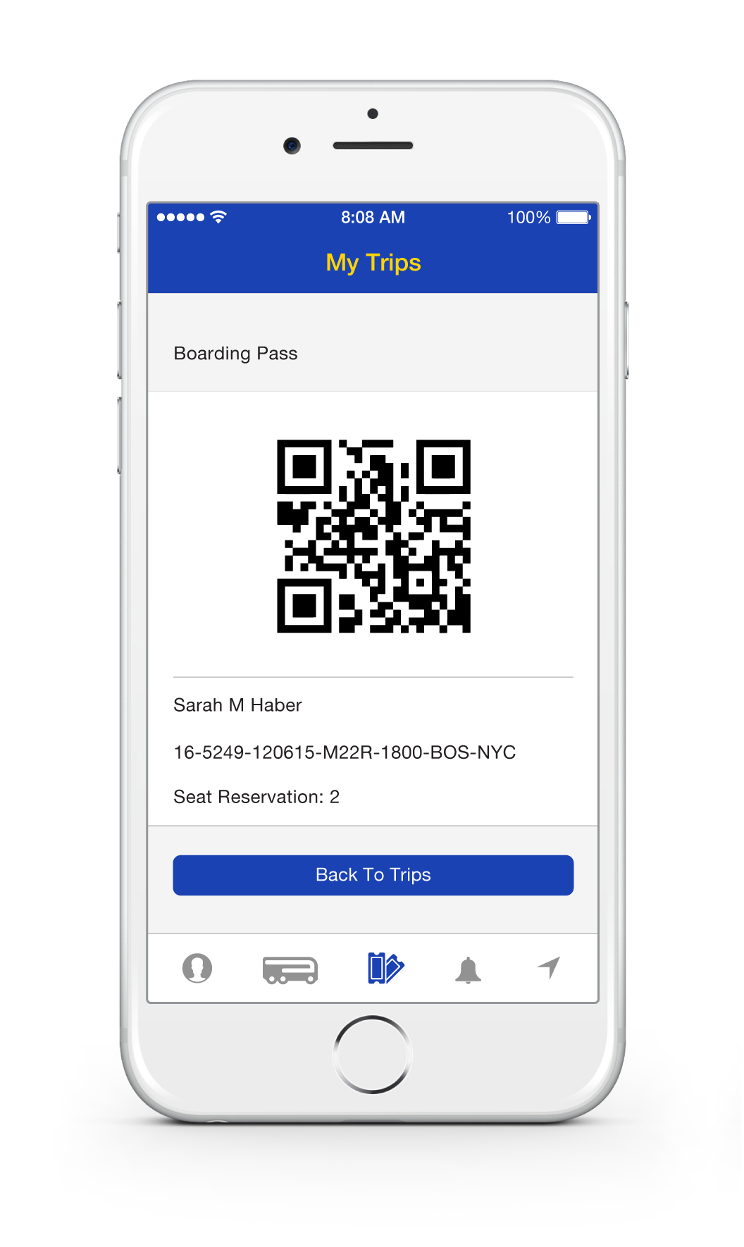
QR code for quick and secure boarding
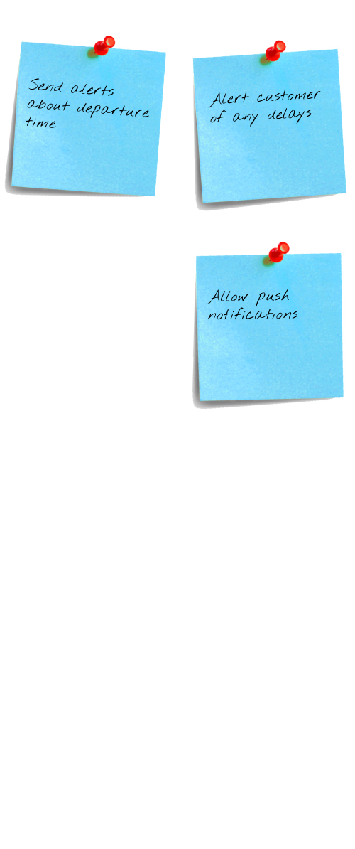
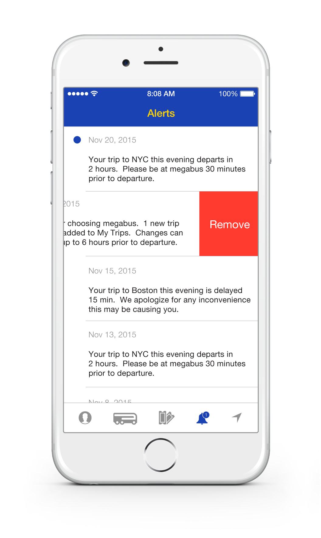
Allowing push notifications sends messages to user without opening the app
New alerts are indicated with blue dot, and can be easily removed once read
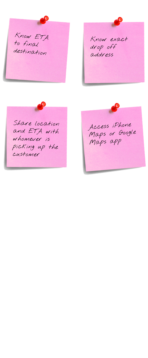
Allowing current location use enables megabus to provide a live map of your booked reservation
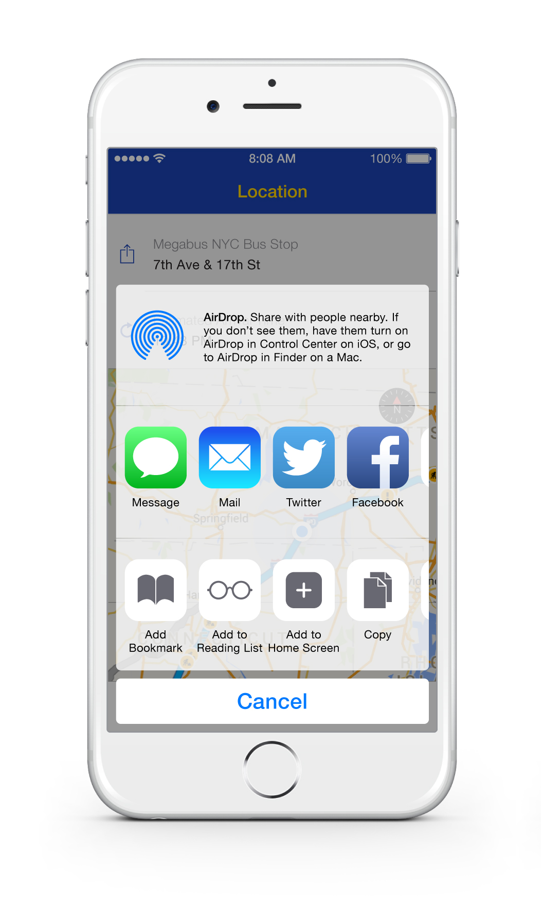
Clear megabus arrival location, which can be shared
Clear estimated arrival time, which can be refreshed as traffic and location changes
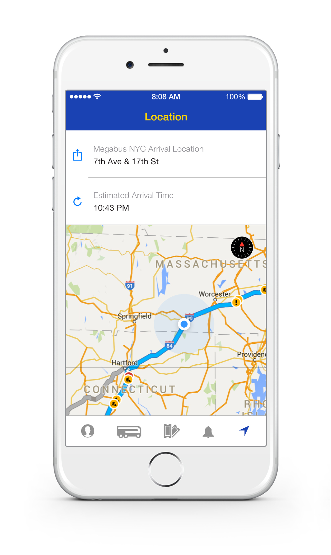
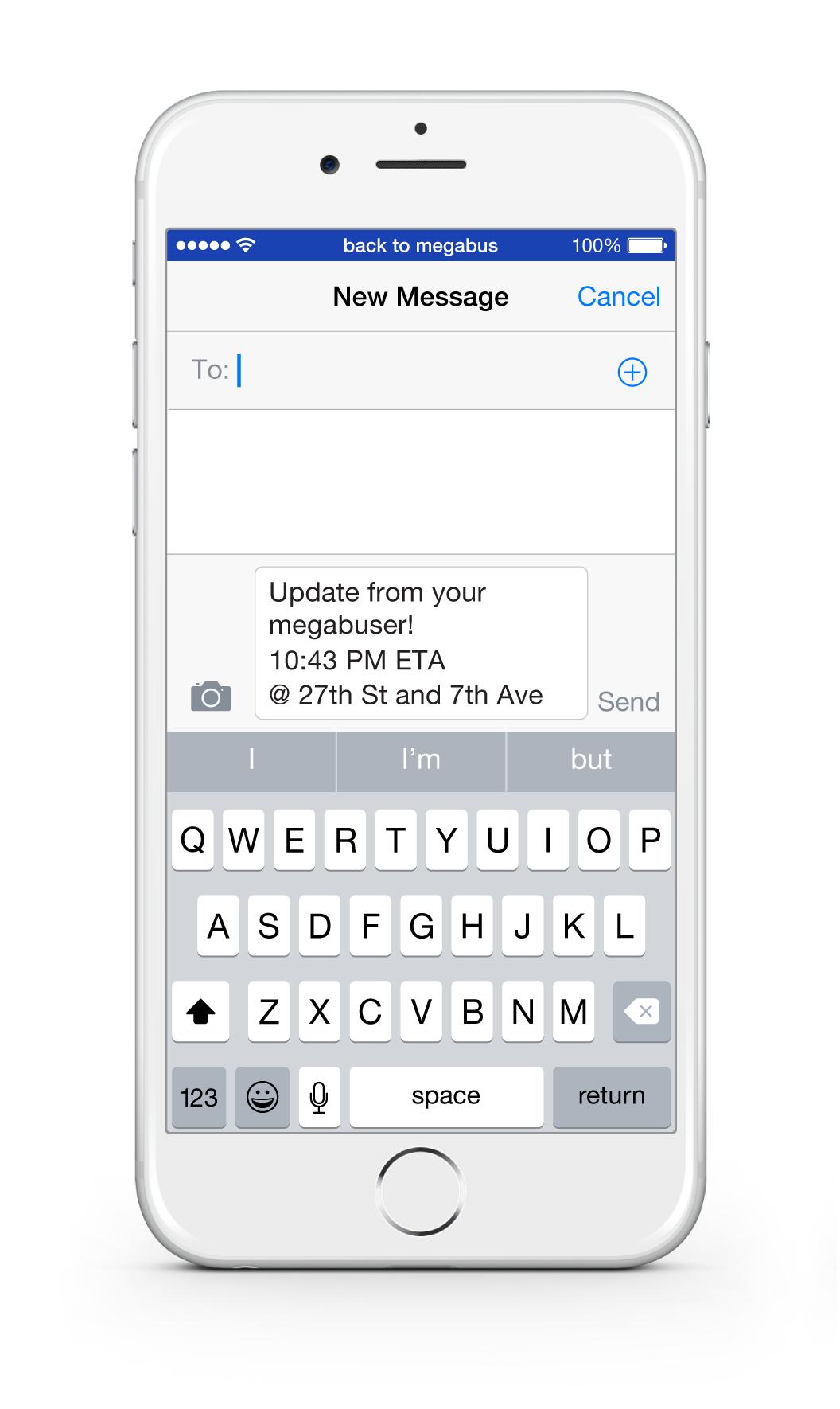
Integrated app experience allows user to share megabus arrival location and estimated arrival time
Automatically generates a message with user's ETA and pick up location
Copyright © 2008 – Stephanie DelVecchio Glaze All Rights Reserved